
Obviously, since they were intended for the city I made last year, I probably won't use any of them for this project. And it also depends on the city, since they just won't work for some cities. I may make a bunch more of these when I've decided on which city I'm doing to draw for the final product. But still, I just wanted to post them here, both for future reference, and maybe to hear some fresh thoughts on them.


Hey Ty,
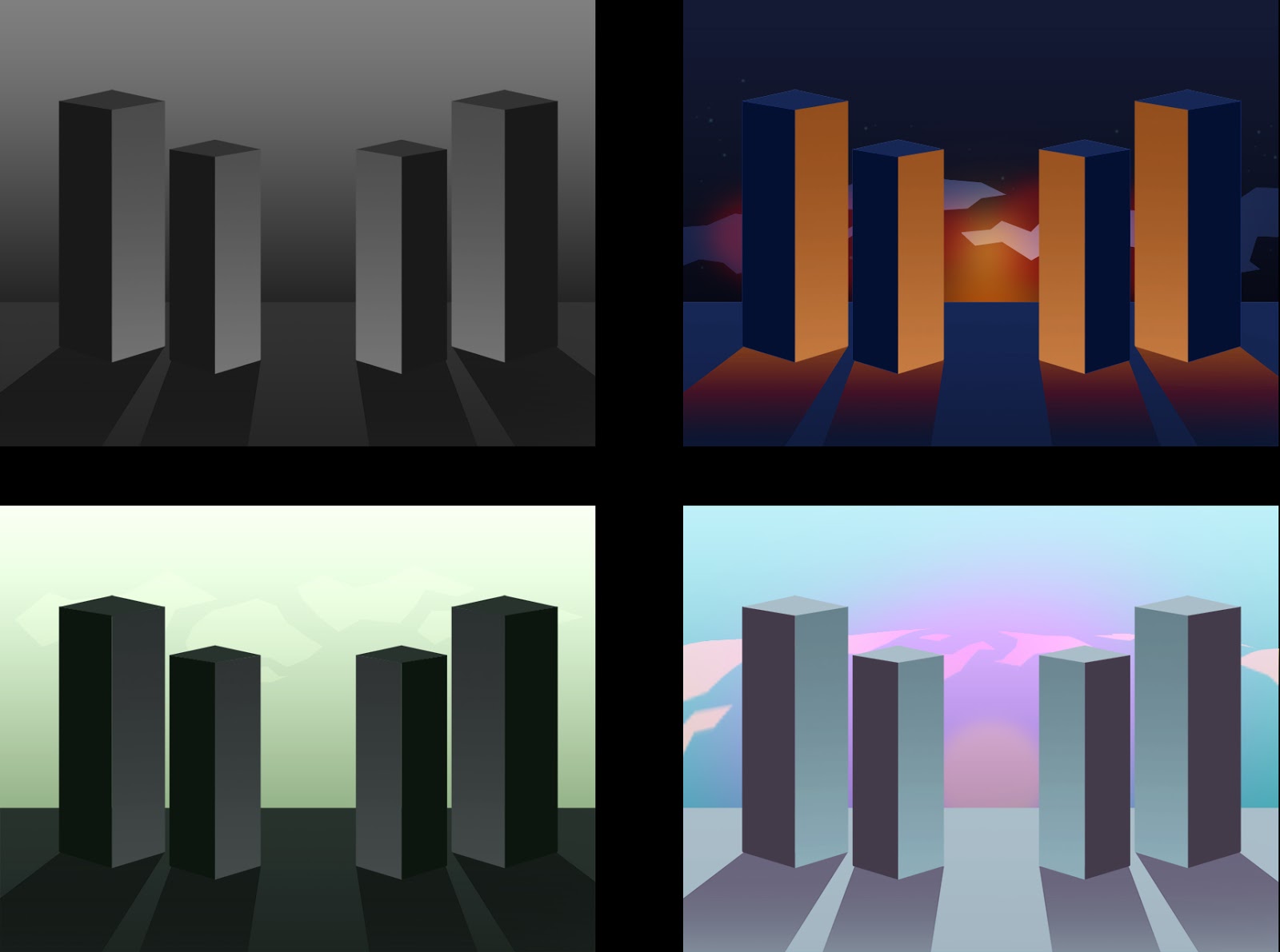
ReplyDeleteokay - some traffic on here - but a repost of old stuff. Hmmm - listen, I want to see some actual drawing on here - I want to see you actually drawing, relaxing, loosening up, doing something different. The colours here are rich and striking, but in all truthfulness, these are just generic tower blocks, and I'd suggest that Calvino is describing far more extraordinary places... I'd like to see you begin this project, and draw - step away from your preferred tools in Photoshop and try something different. This year is all about change, transformation and ensuring against history repeating itself... you have your mission! Onwards, Ty, onwards!
Hey Tyler it's Mark.
ReplyDeleteI'm starting to get a little worried: You haven't posted anything on your blog in over a fortnight so I don't know where you are with your project. Is everything okay?
If you're busy then I can understand, but try to get back into the habit of spending just a little time each evening posting up what you've done. I can't help you out if I don't hear anything from you.